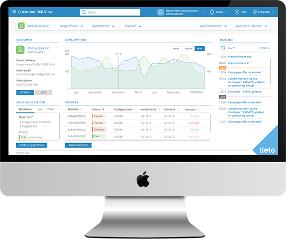
Tieto Smart Utilities

Comprehensive CRM application for energy companies

Tieto Smart Utilities Application

Introduction

TietoEvry is a large international corporation with more than fifteen thousand employees and is one of the largest IT companies in Europe. Its customers are mainly large corporations and governments.

The Tieto Smart Utilities application consists of several separate applications that are developed as a customizable product. In this case study I would like to show some details from the invoice management module where I took part.


Challenge

I received a draft of use cases as a description and a link to explore current application which we were redesigning. Because of company processes I was not allowed to be in touch with real end users and execute a user research or user testing.

Current processes exploration

First I went through the current application and went through current user scenarios. I also found there were about 6 different navigations in the application. Three of them needed to be transferred to the new environment, the rest were only related to the original functionality which is not going to be a part of new design.

A bit shocking thing was that the main elements of the Call to Action were hidden in the right-click dialog, which was not expected by the users.

Process optimisation

Based on exploration in current application, heuristic analysis and current processes I prepared a new version of user flows and started paper-pencil sketches.

Prototypes and tests

When the team made an agreement about the flows and basic layouts I used a prototyping tool for making a clickable prototype.

One of the main challenges was how to smoothly involve this module navigation into the whole context.

For design validations we used our colleagues from different teams and executed guerilla user testing.


My Outcome

Process models, customer journeys, sketches, prototypes, component library, design system / style guide, visuals

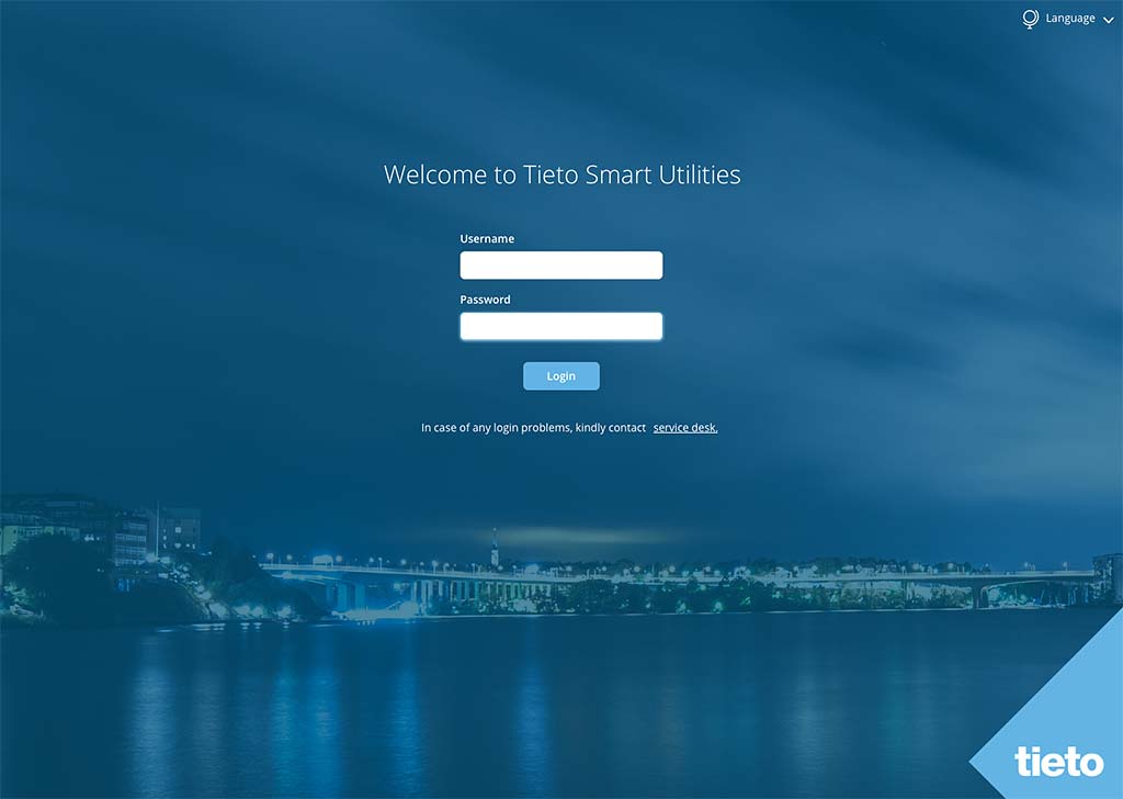
Login screen

Login screen

As a port of scope there was a login process optimisation because current version used several types of isolated logins. This new login screen was simplified into two basic input fields with a vision of future enhancment - login via SSO.

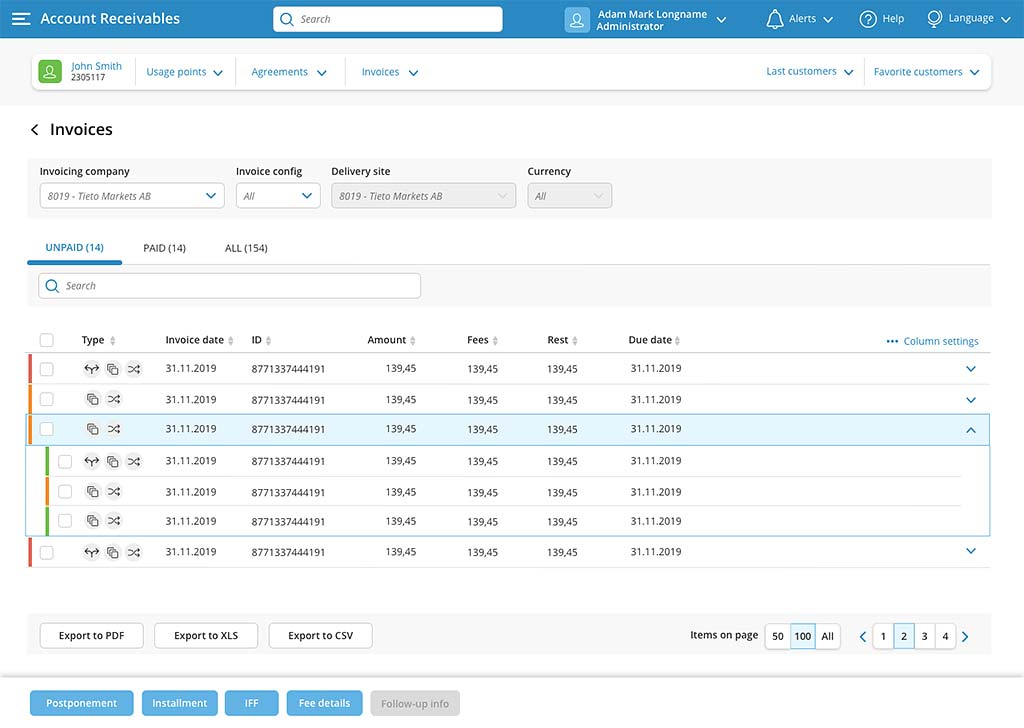
Invoice list

Invoices

This screen shows a list of invoices. First impression might be that this screen contains several primary buttons which is against design best practise. This pattern was found as very useful and we received a very valuable feedback from the customer because the customer clerks as users may do multiple actions with the equal priority. During our design process we found this solution much more user friendly than having multiple secondary buttons instead. For users it was very benefitial having fixed footer and low prio buttons not fixed and most of the time hidden in the bottom of the screen.

Top bar

Top bar and top navigation

I have sorted information in these two boxes into three main areas:

  • Top bar (blue) - User (customer clerk) information, settings, notifications etc.
  • Customer information - the customer clerk sees information aboout the customer who is actually on the phone and the clerk is able to navigate to his usage points, agreements, invoices etc.
  • Customer navigation - the customer clerk is able to quickly skip back to last customers because it happens that the clerk needs to add anything later.
Filter

Invoice filtering

Customer clerk is able to filter results from many points of view, even some atributes do not need to be visible as columns in the table below.

Tabulka

Table / Invoice list

Customer clerk is able to filter results from many points of view, even some atributes do not need to be visible as columns in the table below. It is also possible to sort results or select fields to display.

Call to action

Main CTA buttons

I was persuated that all these buttons have an equal priority and the design best practise "one primary button" here does not make sence. We agreed to do it this way and we received a very positive feedback from our customer.

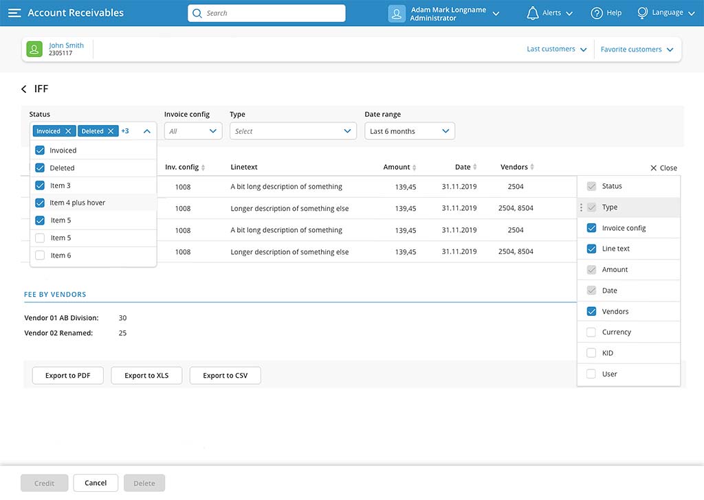
IFF

IFF / AR module

This module supports the calculation of fees, arrears and overpayments.

I simplified filtering by designing multiselect dropdown boxes and also elegantly solved the excessive number of table columns, when only the most important ones are displayed by default, the others can be turned on/off manually according to the user's needs.


Because of NDA, the customer name, structure, texts, processes and content are dummied. Some visual details are also changed. Thanks for your understanding.


Recommendations


Tomas is a talented professional who has a good point for the detail. On the solution he looks from a more perspective and can find more way how to solve it in a practical way.

Jan Gavenda

Lead Software Developer, Tieto

Tomas is very positive person. He is a great team player willing to cooperate. He has big experience as Designer and excellent communication skills. It was a great pleasure to work with Tomas.

Michaela Klusova

Manager, Tieto