Mobile Logistics Application

Tablet application for a parcel delivery company

Logistic Company Application

Introduction

The customer is one of the most important producers and distributors of kitchen and bathroom equipment in the Czech republic. They do not hire external parcel delivery companies but they use own fleet with more than 100 vans, trucks and other cargo cars.

My role was the whole design process, process optmisation and preparing delivery for inhouse developers.


Challenge

The current delivery process is too slow, characterized by a lot of manual work and huge paper consumption. The goal of our project was to automate as many processes as possible and to reduce paper printings by 80%.

Explore

Firstly I monitored current processes and talked to delivery manager.

Original Login Process

Current Login Process detail

For better problem understanding I made a user research. I was declined to speak to the drivers, but Autocont had a division focused on IT delivery so I asked these colleagues to help me. So I was observing their routine and it was a valuable eye opener.

Define

I visualised the processes, and together with the customer we found several points which might be optimised. Proces original

Login Process proposal

Ideation

Based on process models I created prototypes. Firstly I started with pencil paper low fidelity sketches followed by a clickable black and white prototype.

Prototypes and Tests

Based on updated processes and sketches I user tested prototypes. I had no chance to met real drivers but the manager had one day in week shift as a driver so his feedback was incredibly valuable.

Visual Design

Once the prototypes were ready, I created visuals. I was focused mostly on readability, ease in catching the correct buttons and support to the delivery and disclaimer processes.


My Outcome

Business process models, wireframes, visuals.

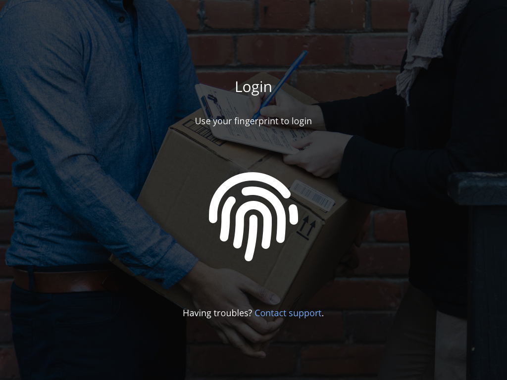
Login screen

Login screen simplification.

All credentials are stored in Active Directory and authentication is provided by touch ID in a matter of seconds.

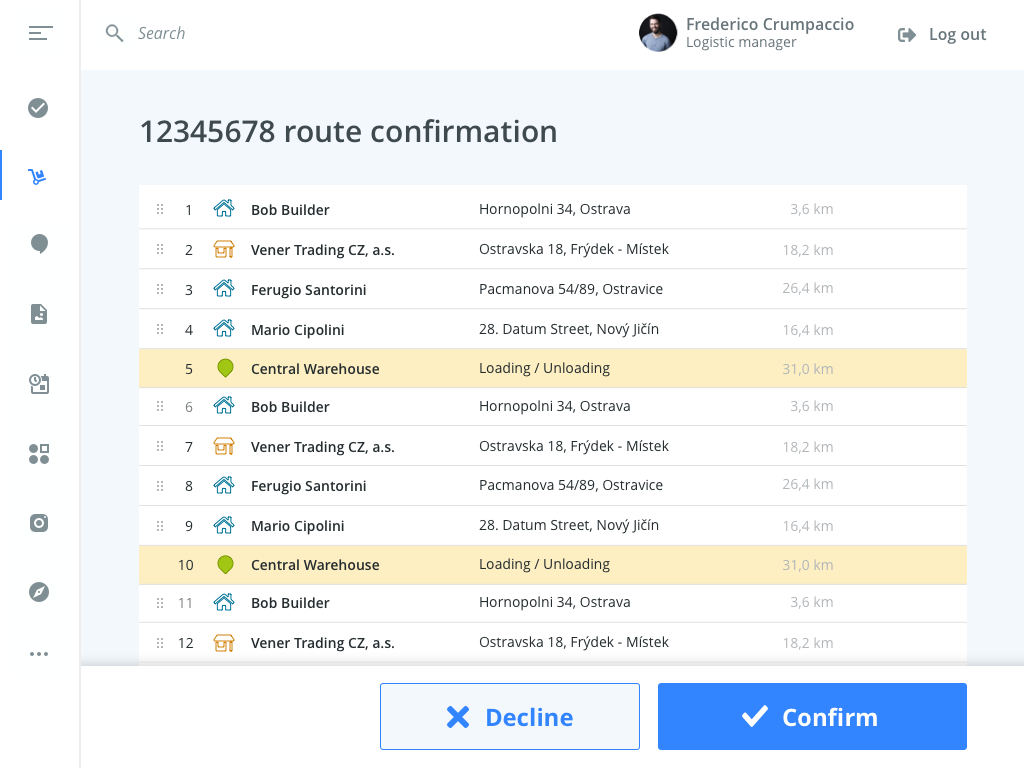
Route confirmation

Route confirmation

After login, the user has to confirm his route for the day. Instead of signing a special paper he has it available digitally in his tablet.

We were also considering a version with a map instead of this list. I received a feedback from the customer, that users prefer customers' names instead of map, because the drivers know theit teritorry really well.

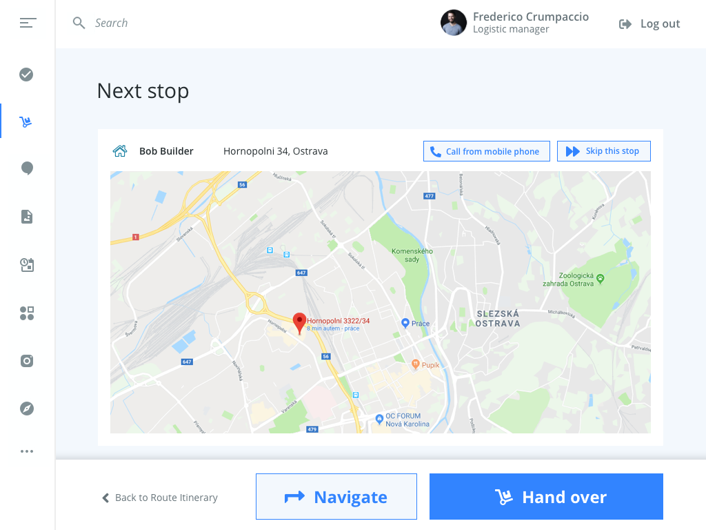
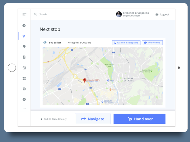
Next stop

Next stop

When confirmed, user/driver goes directly to the first customer. The application is connected to the GPS navigation and can navigate automatically. During interviews with drivers I found that drivers sometimes know the best directions so they can navigate themselves.

The application also provides bluetooth connection with a mobile phone, meaning the driver can automatically send a message when he arrives and in case of trouble call the customer without typing number.

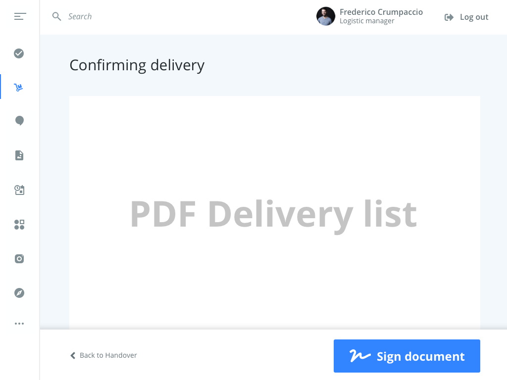
Confirm delivery

Delivery confirmation. More details NDA, sorry.

During hand over, the customer checks the load and the delivery list.

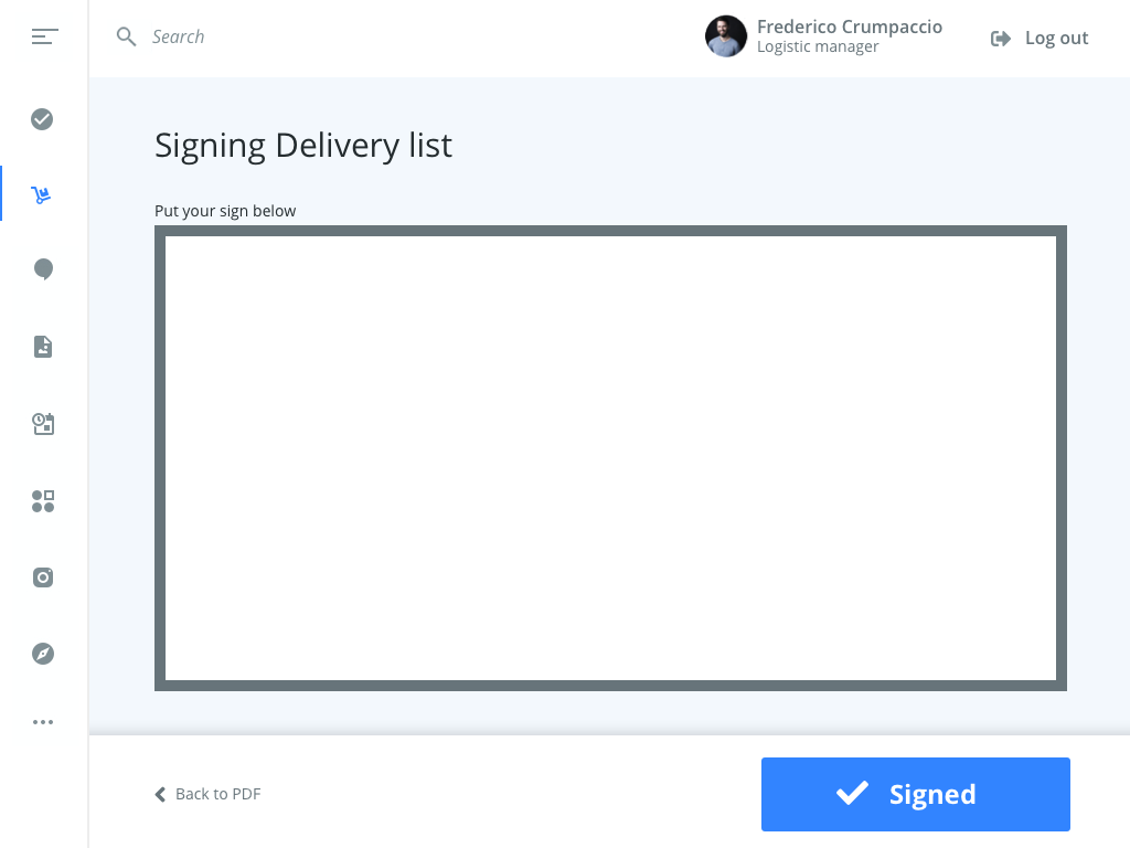
Sign Delivery List

Delivery list signature

If the delivery is OK, the customer is asked to sign.

I also created designs for alternative scenarios like complaint process, navigation, calling the customer, loading process...


Because of NDA, the customer name, structure, texts, processes and content are dummied. Some visual details are also changed. Thanks for your understanding.


Results

85 %
Paper and toner saved
60 %
Administrative time saved
16 %
Effectivity increased